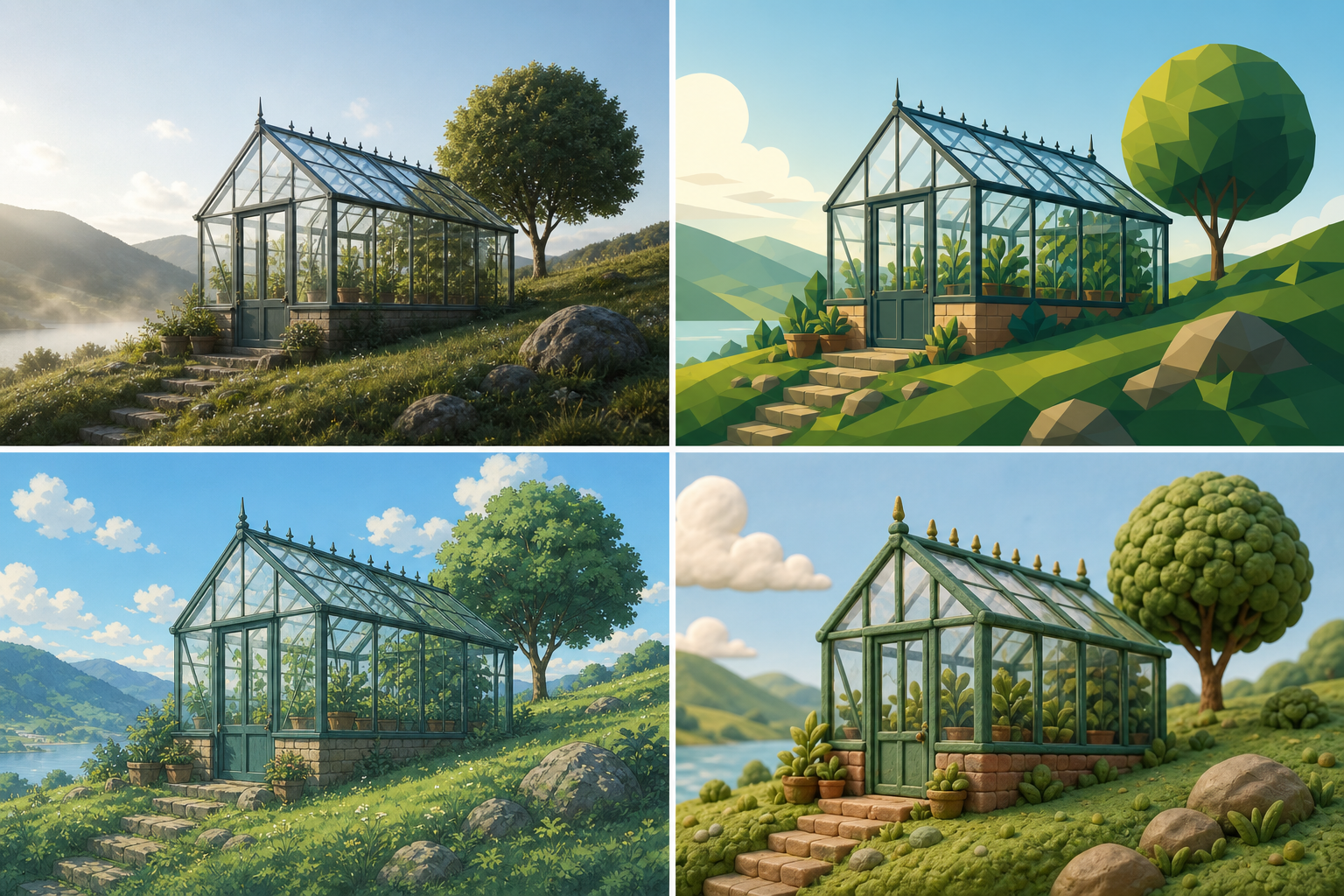
Style changes the visual rules.
The subject answers what the image shows. Style answers how that subject is represented. The same greenhouse can become a realistic architectural photograph, a flat magazine illustration, a painted animation background, or a tactile clay render.
Those versions differ in edge treatment, depth, texture, color behavior, lighting, and surface finish. Naming a style helps the model choose a consistent set of those visual rules.
Style is not a substitute for content. Write the subject and scene clearly first. Add style to control interpretation, not to hide an incomplete idea.
Describe style through visible traits.
A broad label such as cinematic, vintage, elegant, or modern leaves too much open to interpretation. A useful style description explains what the label should look like in the finished image.
Medium
Photography, watercolor, ink drawing, vector illustration, pixel art, collage, 3D render, or painted background art.
Rendering treatment
Photorealistic, flat, painterly, cel-shaded, low-poly, hand-cut, highly detailed, simplified, or softly modeled.
Color behavior
Muted earth tones, limited primary palette, pastel gradients, high contrast, monochrome, warm highlights, or cool shadows.
Surface and texture
Paper grain, visible brushwork, halftone dots, clay fingerprints, film grain, smooth plastic, rough ink edges, or clean vector fills.
Light and depth
Flat graphic light, soft studio light, hard flash, volumetric haze, painted atmospheric depth, or shallow photographic focus.
Final image purpose
Editorial illustration, product campaign, cinematic still, game concept art, children’s book image, technical diagram, or poster design.
The main image style families
There are thousands of named aesthetics, but most prompt styles can be described through a smaller set of visual families. Open each group to see useful style examples and the traits that make them specific.
Photography
Photography styles depend on camera position, lens behavior, light source, depth of field, color grading, and the purpose of the image.
- Editorial product photography: controlled studio light, deliberate negative space, refined materials, clean art direction.
- Documentary photography: available light, natural gesture, observed moment, realistic texture, restrained processing.
- Cinematic still: narrative framing, motivated light, controlled contrast, atmospheric depth, filmic color.
- Fashion photography: directed pose, garment detail, strong silhouette, intentional location or studio set.
- Macro photography: extreme close-up, shallow focus, enlarged surface detail, precise highlights.
Illustration and print
Illustration styles are shaped by line quality, shape language, color limits, paper or print texture, and the amount of visual simplification.
- Flat editorial illustration: bold geometric shapes, limited palette, simplified depth, clear visual metaphor.
- Watercolor illustration: translucent washes, soft pigment edges, visible paper, layered color variation.
- Ink drawing: varied line weight, hatching, white space, dry-brush or clean pen texture.
- Screen-print poster: limited spot colors, bold silhouettes, halftone or ink texture, graphic composition.
- Paper collage: cut edges, layered paper, imperfect alignment, printed texture, shallow physical depth.
3D and material-based rendering
3D styles become clear when the prompt names material, geometry, surface finish, light behavior, and the desired amount of realism.
- Clay-style 3D: rounded forms, matte clay surface, small handmade irregularities, soft shadows.
- Low-poly 3D: faceted geometry, simplified forms, crisp planar shading, reduced detail.
- Plastic toy render: smooth molded surfaces, saturated color, rounded edges, bright studio highlights.
- Photoreal CGI: physically plausible materials, accurate reflections, detailed lighting, realistic scale.
- Isometric 3D: fixed elevated angle, parallel geometry, compact scene organization, clean depth cues.
Animation and game art
Animation and game styles require information about line treatment, shading, background detail, perspective, palette, and production context.
- Anime background art: painted environment, atmospheric perspective, selective detail, expressive sky and light.
- Cel-shaded character art: clean linework, flat shadow shapes, controlled highlights, readable silhouette.
- Pixel art: stated sprite scale, limited palette, hard pixel edges, simplified depth and texture.
- Game concept art: cinematic environment design, clear focal route, material studies, functional world detail.
- Children’s animation: friendly proportions, simple shapes, soft color contrast, readable expression.
Graphic design and visual eras
Design movements and eras should be translated into composition, typography space, geometry, palette, and production texture.
- Art Deco poster: symmetrical geometry, stepped forms, metallic accents, high contrast, elegant vertical rhythm.
- Bauhaus-inspired graphic: primary geometry, functional layout, limited colors, strong typographic space.
- Mid-century travel poster: simplified landscape, flat color blocks, screen-print texture, dramatic destination framing.
- 1980s airbrush illustration: smooth gradients, luminous edges, saturated sunset colors, polished fantasy finish.
- Contemporary minimal graphic: reduced palette, precise spacing, one focal shape, restrained surface detail.
Turn a style label into a description.
Keep the style name when it is useful, then add the traits that define what you mean. This makes the instruction easier to reuse across different tools.
Instead of cinematic
Use narrative wide framing, low-key side light, cool shadows, warm practical highlights, atmospheric depth, and filmic color.
Instead of vintage
Name the era, print process, palette, texture, lens behavior, or physical wear that should make the image feel historical.
Instead of minimal
Use one clear subject, reduced palette, controlled negative space, simple geometry, and restrained surface detail.
Instead of 3D
Name the material, geometry, rendering realism, light setup, camera angle, and surface finish.
flat editorial illustration with bold geometric shapes, a limited forest-green and sky-blue palette, simplified perspective, subtle paper grain, crisp edges, and a calm magazine-cover finish
Describe UGC style as a production setup.
“UGC style” is often used as shorthand for an image that feels captured by a customer or creator rather than produced by a large campaign team. The label is too broad on its own. A useful prompt explains the device, framing, light, environment, gesture, and degree of imperfection that create that feeling.
Authenticity does not mean random damage. A believable creator image still has a clear subject and readable action. The casual quality usually comes from proximity, available light, familiar surroundings, slight asymmetry, and evidence of a real moment rather than from heavy blur or artificial noise.
Capture device
Recent smartphone camera, front-facing camera, handheld vertical video frame, or compact point-and-shoot. Choose one believable capture language.
Framing
Arm’s-length close-up, chest-level product demo, mirror view, slightly off-center crop, or an overhead desk shot with natural edge cutoffs.
Light
Window light, overcast daylight, bathroom practicals, kitchen ambient light, or direct phone flash. Name where the light comes from.
Context
Bedroom shelf, lived-in kitchen, car interior, café table, gym locker, or packing desk. Keep only details that make the use case credible.
UGC style skincare photo, authentic, viral, realistic
vertical smartphone photo of a person holding a small amber skincare bottle beside their cheek, arm’s-length framing, relaxed half-smile, soft morning window light from the right, lived-in bathroom shelf softly visible behind them, slightly off-center crop, natural skin texture, neutral phone-camera color, casual creator review frame, no studio backdrop or polished campaign lighting
Product demonstration example
The two examples are specific without pretending that low quality equals authenticity. To derive the content from a real reference, begin with the image-to-text prompt workflow. To compare UGC structure with product, portrait, and character prompts, study the annotated prompt examples.
Keep style in proportion to the image.
One clear style direction is usually easier to control than several competing ones. If you combine styles, state which part comes from each: one can define the medium, another the palette, and another the texture.
- Write the subject and scene before the style description.
- Choose one primary medium or rendering approach.
- Add only the visual traits that matter to the result.
- Avoid style words that contradict the lighting, material, or image purpose.
- Use named creators only when you have a clear reason and the tool permits it. Visible traits are more portable and easier to edit.
When you have a reference but not the words, generate a prompt from your image, then replace broad style labels with the visible traits in this guide.